

I spent an hour with Google Stitch tonight to see what the hype is about. Some things impressed me. Others didn't.
The glass UI needs to stop
Am I the only one that doesn’t like this whole glass-style UI? Apple does it. Google does it. Please stop.
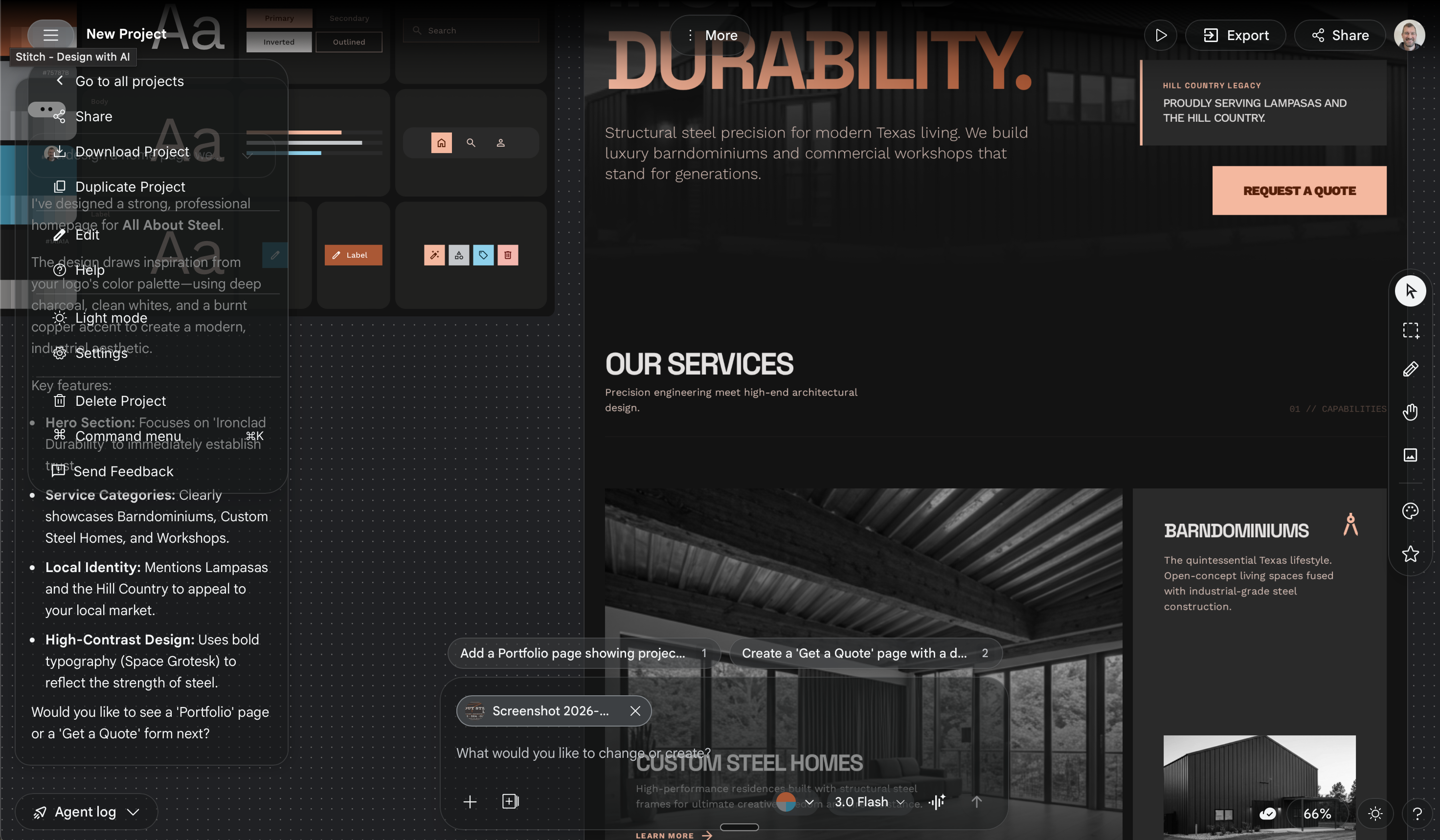
This screenshot is ridiculous. A dropdown menu renders directly over a dialog box. Neither is movable. Other elements on the canvas are movable — so I find myself dragging canvas items around just to read the stationary UI elements.
Layers of translucent panels stacked on top of each other. Harder to read, cluttered, confusing. Not an improvement.
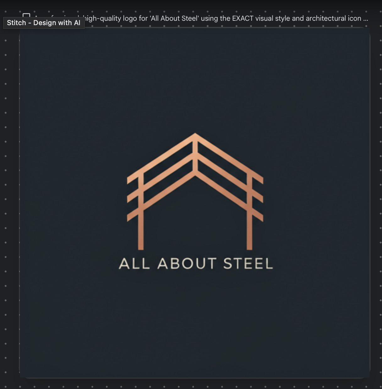
Logos are a mess
Stitch generated some interesting logo marks. One was genuinely cool — but it needed a minor text edit. Good luck with that.
Here’s the original logo it generated. The mark was the best part. But it hallucinated the text “ALABSTEL” instead of the actual business name I gave it.
I asked Stitch to replace “ALABSTEL” with the real business name. Here’s what it gave me:
Web design is genuinely good
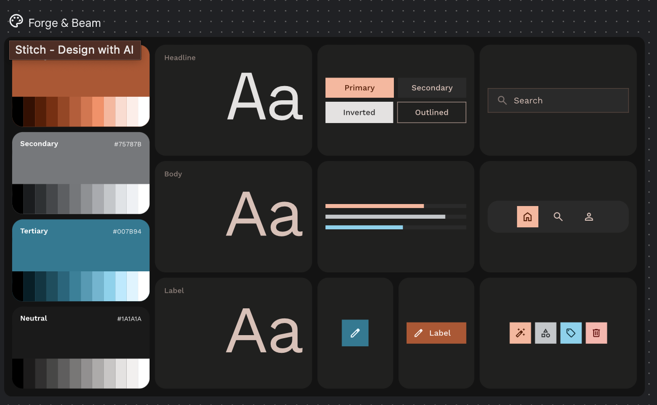
I uploaded a client’s business card. Stitch immediately extracted the color palette — nicely laid out and thorough.
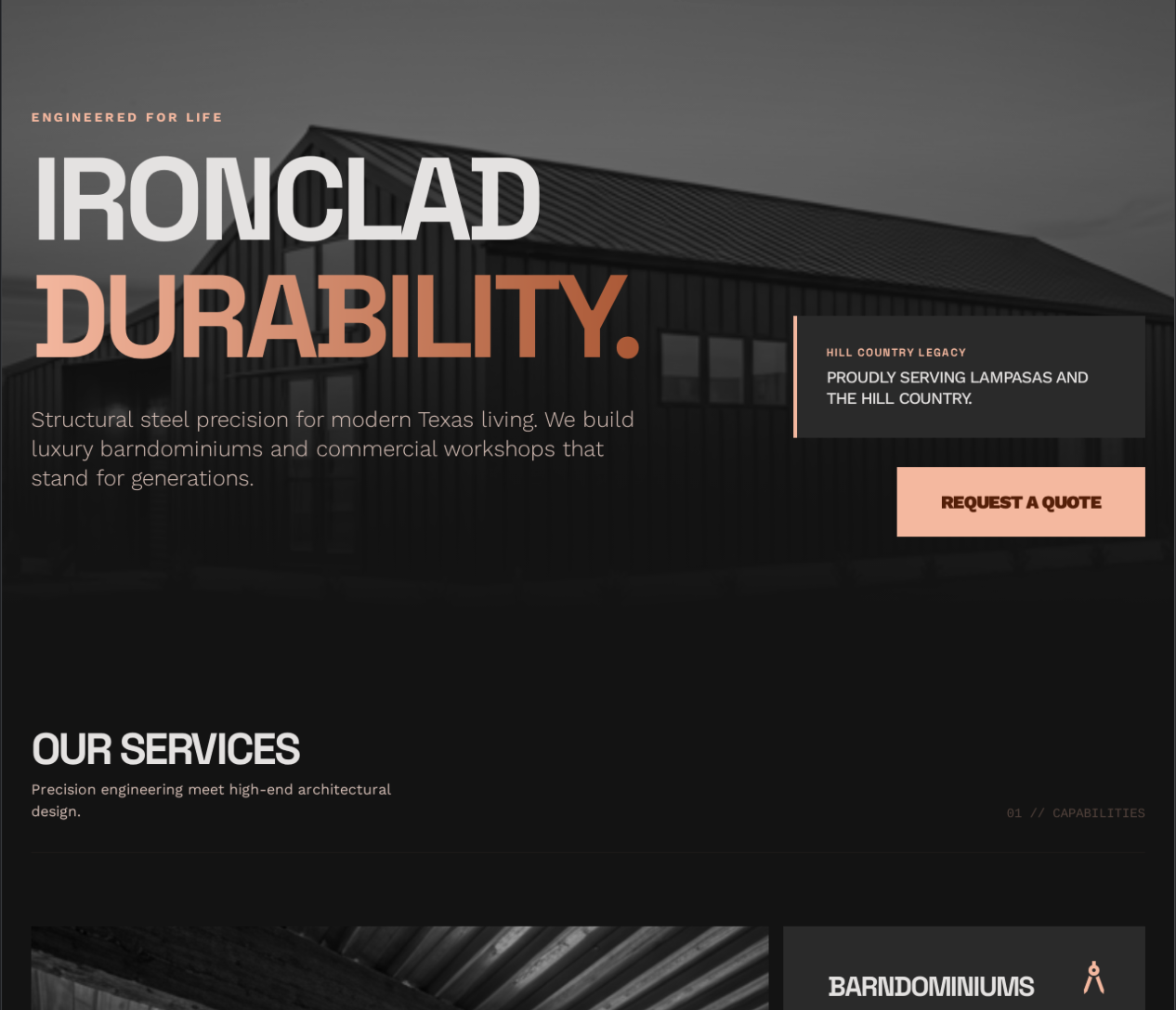
The homepage it generated was unique. Not cookie-cutter. Better than AI-generated website designs from even 6 months ago, and better than what I’ve seen Claude Code produce for web design.
“Select and prompt” — cool idea, rough execution
You can draw a selection around specific areas and reference them in your prompt. Great concept for communicating exactly what needs editing.
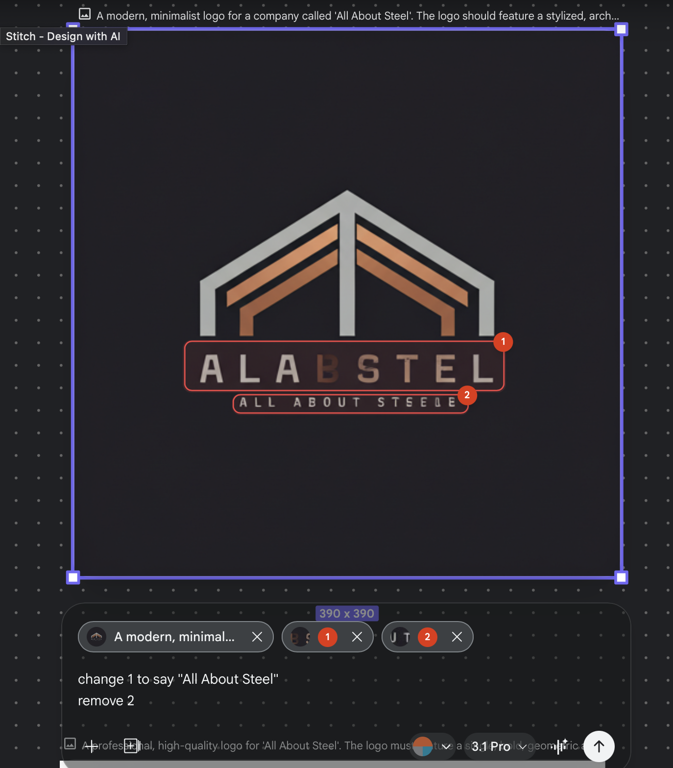
But did it work? Nope. It completely changed everything instead of making the targeted edits. At least it didn’t hallucinate fake words this time.
Bottom line
Stitch is promising for first drafts and exploration. The web design output is legitimately impressive. But targeted edits and logos expose the core limitation of AI design tools right now: they can generate novel creative output but struggle with precise, controlled refinement.
Promising tool. Rough edges.